Make Effective Data Visualisation
Flight Performances for each Carrier in 2016
The code for this vis can be found here.
And you can check it out here.
Summary
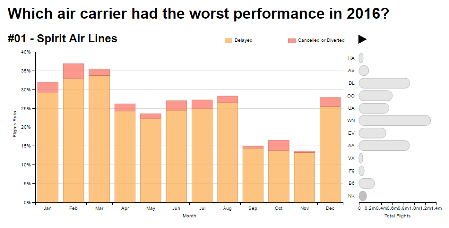
The chart shows the monthly percentages of flight delays and cancellations/diversions for each carrier in the year of 2016. The carriers are sorted by overall delay performance, and the total number of flights for each one is also depicted.
Design
I chose to draw a main stacked bar chart with the following visual encodings: - The ratio between delayed or cancelled/diverted and total flights is represented vertically on the y axis; - Months are displayed horizontally on the x axis; - Delays and cancellations/diversions are represented by different colors;
There is also a secondary bar chart with the following visual encodings: - Carrier codes are displayed vertically; - Total flights for each carrier are represented by the lenghts of the horizontal bars.
At first I made the stacked bars show the number of delayed flights, however, the x axis scale changed too much between carriers, so I changed it to show ratios, so that the scales would be comparable. I chose not to show “on time” flights on the chart, so I could zoom in the scale, allowing a better visualization of the delays and cancellations/diversions. The horizontal bars on the secondary chart were chosen so that visualizers could reason about the number of flights each carrier had, and also to make it possible to order carriers by overall performance. This way the order of bars contributes to the chart storytelling.
After collecting feedback I changed the following: - Assured the order of the months also on Firefox; - Changed the chart title from “2016 Flight Delays by Cause” to “Flight Performances for each Carrier in 2016”, and then to “Which air carrier had the worst performance in 2016?”; - Added a “References” section to communicate the source of the dataset; - Changed the y axis label from “Ratio” to “Flights Ratio”, and made it show percentual values; - Made the x axis of the secondary bar chart visible, to make it clearer that it was also a chart; - Fixed the height of the stacked bar chart, so that the “Month” label would be visible; - Switched months labels to abbreviations instead of numbers; - Stopped showing delays divided into causes, and instead displayed only total delays; - Aggregated cancellations and diversions; - Changed the animation instructions message into a play/pause clickable button; - Made the animation stop at the end of the first cycle; - Changed from carrier names to codes on the secondary horizontal bar chart y axis; - Updated the secondary horizontal barchart colors to grayscale.
Chart Versions
Feedback
Laurent de Vito
“Hi, Interestingly, in Firefox, the months are labeled 12,7,8,… whereas they are correctly labeled in Chromium, but usually, we cannot do much about it. I find the title a bit misleading since you report not only the flights that were delayed but also those that were canceled. Furthermore, could you please cite your sources ? Overall, nicely done!”
Morgana Secco (my wife)
“The y axis show a ratio between what? You should make it clearer that the horizontal bars on the right display the total flights for each carrier. There is no month label on the x axis.”
tianchuanting
“Hi Luiz,
After spending a minute or two looking at your visualisation, my impression is that it is a very well made visualization. I especially like the small details you put into it, like the tooltip and animated guideline. And here is a list of feedback for you consideration.
- I had some difficulty understanding what the vertical axis ‘flight delay’ ratio means. Maybe using something like % of delayed flight might be intuitive.
- Similarly, It took me a while to get what the 1-12 on the horizontal axis is presenting, maybe using month abbrev (Jan, Feb etc) instead will be a better idea. LT”
John Enyeart
“ - It would probably be easier to read if you used month names instead of the numbers 1-12 on your x-axis.
The biggest cause of delay is "NAS”, and I have no idea what that is, so an explanation would be nice.
You might also consider putting in the option to switch the y-axis between ratio and number of flights.
Not sure how I feel about the stacked bar chart in terms of readability. Take a look at the following articles:
storytellingwithdata.com - to stack or not to stack
https://solomonmessing.wordpress.com/2014/10/11/when-to-use-stacked-barcharts/“
martin-martin
"Hello @luizschiller!
That’s a great visualization you are working on here! I agree that it seems you’re putting effort in the details, and it shows : )
Here’s my feedback:
- The encoding of the amount of flights that the airlines each have is very innovative and I haven’t seen this around yet. Great idea :+1: - looks really interesting!
- I was initially confused about what is going on in the graph since it was changing so quickly. I generally prefer if I have the choice to first orient in a visualisation before starting the reel. If you want to have it running right when the user accesses the page, maybe you could make the instructional message on how to start/stop it more obvious (e.g. it could be presented as a clickable button!)
- The tickmarks under the months are different than the ones in the rest of your visualisation. Generally you display ticks where the value descriptions are - but here they are in between the data points. I’d suggest to keep this consistent and simply move the ticks into the middle of the columns
- What is the NAS value about? Most of the options in the legend on top are somewhat self-explanatory, however not all of them are. And without the context of the fact that they are reasons for delays, the correct interpretation becomes even more difficult. A good legend should also have a title explaining what it’s explaining. - Potentially the graphs title could also fulfill this function, but currently it says "Flight Performances” (which is overall better fitting, yet doesn’t explain that you’re displaying “Reasons for flight delays”, encoded with the different colors).
Hope this helps, and great job! Keep it up and you already have a great piece of data viz! : ) “