Investigating the Titanic Dataset with Python
Udacity Data Analyst Nanodegree
First Glance at Our Data
import numpy as np
import pandas as pd
import matplotlib.pyplot as plt
import seaborn as sns

%matplotlib inline

filename = 'titanic_data.csv'
titanic_df = pd.read_csv(filename)
First let’s take a quick look at what we’ve got:
titanic_df.head()
| PassengerId | Survived | Pclass | Name | Sex | Age | SibSp | Parch | Ticket | Fare | Cabin | Embarked | |
|---|---|---|---|---|---|---|---|---|---|---|---|---|
| 0 | 1 | 0 | 3 | Braund, Mr. Owen Harris | male | 22.0 | 1 | 0 | A/5 21171 | 7.2500 | NaN | S |
| 1 | 2 | 1 | 1 | Cumings, Mrs. John Bradley (Florence Briggs Th… | female | 38.0 | 1 | 0 | PC 17599 | 71.2833 | C85 | C |
| 2 | 3 | 1 | 3 | Heikkinen, Miss. Laina | female | 26.0 | 0 | 0 | STON/O2. 3101282 | 7.9250 | NaN | S |
| 3 | 4 | 1 | 1 | Futrelle, Mrs. Jacques Heath (Lily May Peel) | female | 35.0 | 1 | 0 | 113803 | 53.1000 | C123 | S |
| 4 | 5 | 0 | 3 | Allen, Mr. William Henry | male | 35.0 | 0 | 0 | 373450 | 8.0500 | NaN | S |
Handling Missing Values
titanic_df.info()
<class 'pandas.core.frame.DataFrame'>
RangeIndex: 891 entries, 0 to 890
Data columns (total 12 columns):
PassengerId    891 non-null int64
Survived       891 non-null int64
Pclass         891 non-null int64
Name           891 non-null object
Sex            891 non-null object
Age            714 non-null float64
SibSp          891 non-null int64
Parch          891 non-null int64
Ticket         891 non-null object
Fare           891 non-null float64
Cabin          204 non-null object
Embarked       889 non-null object
dtypes: float64(2), int64(5), object(5)
memory usage: 66.2+ KB
From this initial observation we notice that, from 891 passenger records: - 714 have valid ages; - only 204 have cabin records; - 2 embarkments are missing.
The rows with missing ages and embarkment values will be dropped whenever an analysis depends on them.
The cabin values are not going to be used in this analysis, so they will not be touched.
Other Considerations
I’m not going to analyze the number of Siblings/Spouses or Parents/Children isolatedly. Instead I am using the presence or not of family members aboard, represented by the ‘Family’ column.
titanic_df['Family'] = (titanic_df['SibSp'] > 0) | (titanic_df['Parch'] > 0)
We also are going to need a column stating if a passenger is a child or an adult. 15 is going to be the childhood age threshold for our study.
titanic_df['AgeRange'] = pd.cut(titanic_df['Age'], [0, 15, 80], labels=['child', 'adult'])
Now I’m getting rid of the data we are not going to use:
titanic_df.drop(['PassengerId', 'Name', 'SibSp', 'Parch', 'Ticket', 'Cabin'], axis=1, inplace=True)
Which leaves us with the following columns, plus ‘Sex’, ‘Embarked’ and ‘Family’:
titanic_df.describe()
| Survived | Pclass | Age | Fare | |
|---|---|---|---|---|
| count | 891.000000 | 891.000000 | 714.000000 | 891.000000 |
| mean | 0.383838 | 2.308642 | 29.699118 | 32.204208 |
| std | 0.486592 | 0.836071 | 14.526497 | 49.693429 |
| min | 0.000000 | 1.000000 | 0.420000 | 0.000000 |
| 25% | 0.000000 | 2.000000 | NaN | 7.910400 |
| 50% | 0.000000 | 3.000000 | NaN | 14.454200 |
| 75% | 1.000000 | 3.000000 | NaN | 31.000000 |
| max | 1.000000 | 3.000000 | 80.000000 | 512.329200 |
We can see that aproximately 38% of the passengers survived and the highest fare is over 15 times the average.
Let’s raise some questions:
- What is the survival rate by class, sex and age? What about combining these factors?
- Was the fare the same for men and women?
- What fraction of the passengers embarked on each port? Is there a difference in their survival rates?
- Is the presence of a family member a good indicator for survival?
1. What is the survival rate by class, sex and age? What about combining these factors?
Let’s take a look at the distribution of passengers by age and fare, grouped by sex and class, and with survival information. It will give us some global insights about the data. But first, removing rows with missing ages:
titanic_df_clean_age = titanic_df.dropna(subset=['Age'])
def scatter_plot_class(pclass):
    g = sns.FacetGrid(titanic_df_clean_age[titanic_df_clean_age['Pclass'] == pclass],
                      col='Sex',
                      col_order=['male', 'female'],
                      hue='Survived',
                      hue_kws=dict(marker=['v', '^']),
                      size=6)
    g = (g.map(plt.scatter, 'Age', 'Fare', edgecolor='w', alpha=0.7, s=80).add_legend())
    plt.subplots_adjust(top=0.9)
    g.fig.suptitle('CLASS {}'.format(pclass))

# plotted separately because the fare scale for the first class makes it difficult to visualize second and third class charts
scatter_plot_class(1)
scatter_plot_class(2)
scatter_plot_class(3)
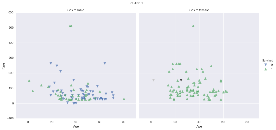
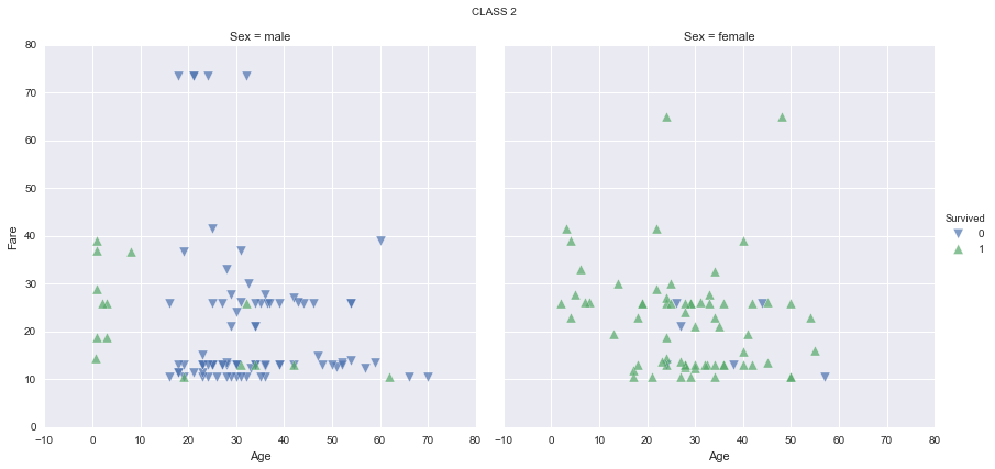
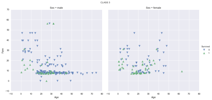
It seems like women have a much higher survival rate, specially in first and second classes. It seems too that children have a higher survival rate, specially in first and second classes again. Let’s find out the survival rate by class, sex and age range, and plot the results for a better understanding:
survived_by_class = titanic_df_clean_age.groupby('Pclass')['Survived'].mean()
survived_by_class
Pclass
1    0.655914
2    0.479769
3    0.239437
Name: Survived, dtype: float64
survived_by_sex = titanic_df_clean_age.groupby('Sex')['Survived'].mean()
survived_by_sex
Sex
female    0.754789
male      0.205298
Name: Survived, dtype: float64
survived_by_age = titanic_df_clean_age.groupby('AgeRange')['Survived'].mean()
survived_by_age
AgeRange
child    0.590361
adult    0.381933
Name: Survived, dtype: float64
fig, (axis1,axis2,axis3) = plt.subplots(1, 3, figsize=(16,6))

ax = survived_by_class.plot.bar(ax=axis1, color='#5975A4', title='Survival Rate by Class', sharey=True)
ax.set_ylabel('Survival Rate')
ax.set_ylim(0.0,1.0)
ax = survived_by_sex.plot.bar(ax=axis2, color='#5F9E6E', title='Survival Rate by Sex', sharey=True)
ax.set_ylim(0.0,1.0)
ax = survived_by_age.plot.bar(ax=axis3, color='#B55D60', title='Survival Rate by Age Range', sharey=True)
ax.set_ylim(0.0,1.0)
(0.0, 1.0)
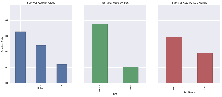
As expected (since we all watched the Titanic movie 😉), the first class has a higher survival rate than the second, which has a higher survival rate than the third, and women and children have a higher chance of survival than men and adults, respectively.
Now combining the three factors and visualizing the plots:
grouped_data = pd.concat(
    [titanic_df_clean_age.groupby(['Pclass', 'Sex', 'AgeRange'])['Survived'].mean(),
     titanic_df_clean_age.groupby(['Pclass', 'Sex', 'AgeRange'])['Survived'].count()],
    axis=1)
grouped_data.columns = ['Survived', 'Count']
grouped_data
| Survived | Count | |||
|---|---|---|---|---|
| Pclass | Sex | AgeRange | ||
| 1 | female | child | 0.666667 | 3 |
| adult | 0.975610 | 82 | ||
| male | child | 1.000000 | 3 | |
| adult | 0.377551 | 98 | ||
| 2 | female | child | 1.000000 | 10 |
| adult | 0.906250 | 64 | ||
| male | child | 1.000000 | 9 | |
| adult | 0.066667 | 90 | ||
| 3 | female | child | 0.533333 | 30 |
| adult | 0.430556 | 72 | ||
| male | child | 0.321429 | 28 | |
| adult | 0.128889 | 225 |
g = sns.factorplot(
    x='AgeRange',
    y='Survived',
    col='Pclass',
    row='Sex',
    data=titanic_df_clean_age,
    margin_titles=True,
    kind="bar",
    ci=None)
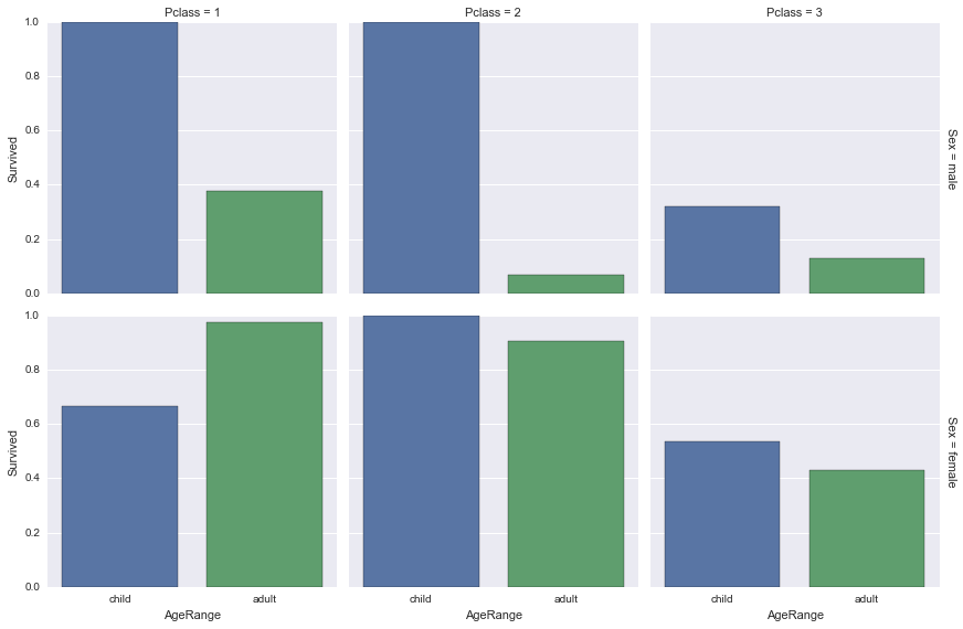
Analysing the three factors combined gives us expected results too. It is interesting to see that even the women from the third class have a higher survival rate than the men from first. It indicates that saving women had a higher priority than saving the richer classes.
Saving children also seemed like a higher priority as on all permutations of factors except first class women, where one of three female children died, they had a higher survival rate.
So we can conclude that saving women and children was indeed a priority on the Titanic shipwreck.
2. Was the fare the same for men and women?
While looking at the scatter plots shown in the first question I noticed that women seemed to be more spreaded among the ‘Fare’ axis, so it motivated me to check if the average fare paid by women was really higher than men’s.
Let’s check the mean fare paid by each sex:
fare_by_sex = titanic_df.groupby('Sex')['Fare'].mean()
fare_by_sex
Sex
female    44.479818
male      25.523893
Name: Fare, dtype: float64
ax = fare_by_sex.plot.bar(title='Fare Average and Sex')
ax.set_ylabel('Average Fare')
<matplotlib.text.Text at 0xa7d69b0>
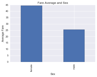
It indeed seems that women paid way more than men on average. Women’s average fare is higher than I expected. Maybe it is due to the women of the first class. Let’s group the data by class and check it out:
fare_by_class_sex = titanic_df.groupby(['Pclass', 'Sex'])['Fare'].mean()
fare_by_class_sex
Pclass  Sex
1       female    106.125798
        male       67.226127
2       female     21.970121
        male       19.741782
3       female     16.118810
        male       12.661633
Name: Fare, dtype: float64
ax = fare_by_class_sex.plot.bar(figsize=(16,4), title='Fare Average by Class and Sex')
ax.set_ylabel('Average Fare')
<matplotlib.text.Text at 0x8c7e590>
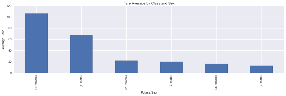
The average fare paid by women is higher than men’s on every class, although the fares on second class are almost equal. I wonder why women paid more… Maybe they demanded more privileges than men, but who knows…
3. What fraction of the passengers embarked on each port? Is there a difference in their survival rates?
Just for curiosity’s sake, let’s find out the proportion of passengers embarked on each port (C = Cherbourg; Q = Queenstown; S = Southampton), and their survival rates, but first, removing rows with missing embarkment values:
titanic_df_clean_embarked = titanic_df.dropna(subset=['Embarked'])
embarked = titanic_df_clean_embarked.groupby('Embarked').mean()
embarked['Count'] = titanic_df_clean_embarked['Embarked'].value_counts()
embarked
| Survived | Pclass | Age | Fare | Family | Count | |
|---|---|---|---|---|---|---|
| Embarked | ||||||
| C | 0.553571 | 1.886905 | 30.814769 | 59.954144 | 0.494048 | 168 |
| Q | 0.389610 | 2.909091 | 28.089286 | 13.276030 | 0.259740 | 77 |
| S | 0.336957 | 2.350932 | 29.445397 | 27.079812 | 0.389752 | 644 |
fig, (axis1,axis2) = plt.subplots(1, 2, figsize=(14,6))

sns.countplot(x='Embarked', data=titanic_df_clean_embarked, order=['S','C','Q'], ax=axis1)
sns.barplot(x=embarked.index, y='Survived', data=embarked, order=['S','C','Q'], ax=axis2)
<matplotlib.axes._subplots.AxesSubplot at 0xa98cb30>

The survival rate for passengers embarked on Cherbourg is higher than both other ports’. That is no wonder, since the mean ‘Pclass’ value for this port is 1.89 - way lower than Queenstown’s 2.91 and Southampton’s 2.35 - which means that people that embarked there belonged to richer classes, which we’ve already seen that have better survival rates than the poorer ones.
4. Is the presence of a family member a good indicator for survival?
Finally, let’s check if having a family member aboard means a higher survival chance:
survived_by_family = titanic_df_clean_age.groupby('Family')['Survived'].mean()
survived_by_family
Family
False    0.321782
True     0.516129
Name: Survived, dtype: float64
ax = survived_by_family.plot.bar(color='#5975A4', title='Survival Rate by Family Presence')
ax.set_ylabel('Survival Rate')
<matplotlib.text.Text at 0xaa26b90>
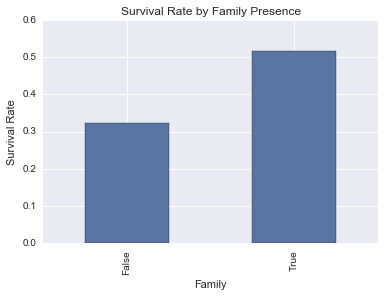
The data shows that having a family member aboard indicates a better chance for survival. But why is that? Let’s check some other numbers about family presence, like it’s relation with class, sex and age range:
family_by_class = titanic_df_clean_age.groupby('Pclass')['Family'].mean()
family_by_class
Pclass
1    0.537634
2    0.462428
3    0.366197
Name: Family, dtype: float64
family_by_sex = titanic_df_clean_age.groupby('Sex')['Family'].mean()
family_by_sex
Sex
female    0.616858
male      0.328918
Name: Family, dtype: float64
family_by_age = titanic_df_clean_age.groupby('AgeRange')['Family'].mean()
family_by_age
AgeRange
child    0.927711
adult    0.369255
Name: Family, dtype: float64
fig, (axis1,axis2,axis3) = plt.subplots(1, 3, figsize=(16,6))

ax = family_by_class.plot.bar(ax=axis1, color='#5975A4', title='Family Presence by Class', sharey=True)
ax.set_ylabel('Average Family Presence')
ax.set_ylim(0.0,1.0)
ax = family_by_sex.plot.bar(ax=axis2, color='#5F9E6E', title='Family Presence by Sex', sharey=True)
ax.set_ylim(0.0,1.0)
ax = family_by_age.plot.bar(ax=axis3, color='#B55D60', title='Family Presence by Age Range', sharey=True)
ax.set_ylim(0.0,1.0)
(0.0, 1.0)

We can see that family presence is higher on: - first class; - female sex; - children.
We have already discovered that these three factors show a higher survival rate, so maybe the higher survival rate for passengers with family members is more due to them than to the presence of family itself.
Conclusion
All the results presented on this report just show correlations between pieces of data. It is important to highlight that correlation does not imply causation. To make statistically valid statements, tests like chi-squared tests and t-tests should be applied.
To discover if class, sex and age have a relationship with survival, we make four chi-squared tests - one for each variable individually, and one for all combined - and find out if they really do matter, as this study suggests.
The same goes to find out if the embarkment site or the presence of a family member have relationships with survival.
To find out if the average fare was the same for men and women we must hypothesize that there was no difference, and then make a t-test to check if the difference is significative as this study suggests.
Thank you for reading!